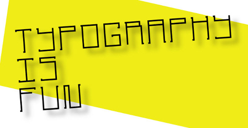
 In our last post, “10 Graphic Design tips for e-learning educators”, we provided a few essential guidelines for improving the look and feel of your e-learning content.
Such a list, of course, can only offer a basic overview of the numerous things an educator needs to know when designing his e-learning courses. Don’t worry, though, because we’re here to expand on each of those guidelines and get into specifics, starting with the black art of fonts and typography.
It cannot be emphasized enough: graphic design is mostly typography. Good typography ― which involves choice of fonts, font-sizes, line length, columns etc, can lift even the most mediocre content. Bad typography can render even the best e-learning material unreadable.
Fortunately, while typography is something that can take years to fully master, you can get eighty-percent of the way there by following a few simple rules:
Choose your fonts wisely (or stick to the standards)
In an era when OSes come with 100s of fonts and modern web browsers offer us the ability to serve our users any font we like among tens of thousands, it’s tempting to pick up exotic looking fonts, or render your content in fancy web-fonts. Don’t. Unless you know what you’re doing, it’s better to stick with the standard, boring but reliable, fonts available in all platforms (Arial, Verdana, Times, Georgia, etc).
Most freely available web-fonts are of low typographic quality (if not downright tacky). Even nicely done web-fonts often look bad in older versions of Windows or older browsers, whereas fonts bundled with Windows and OS X have been finely tuned by professionals to look good on modern LCD displays. As an added bonus, built-in fonts are already installed on your users’ computers, so, unlike web fonts, they load immediately.
The three-fonts-max rule
A common mistake many webmasters make is using too many fonts. This looks amateurish. Keep your font-count low, using no more than two or three fonts (e.g one for your titles and one for your copy).
Keep in mind that not all fonts are created equal. Some are designed for readability and are great for long text, while others are more ornamental or fancy and should be reserved for titles and headings. As a general rule, sans-serif fonts (such as Arial, Verdana, Calibri, Helvetica, etc) have been shown to make it easier to read long passages of text on a computer display with limited resolution (that is all, except the latest modern hi-DPI monitors).
The warning against using too many different fonts also holds for using too many different font sizes and/or weights. Stick with fewer, well thought-out font-sizes, preferably based on the hierarchical structure of your content (large font size for the titles, slightly smaller for your subtitles, medium for your content, small for footnotes and asides, etc).
Use fonts to set the mood
You should not base your font choices merely on whether you like a particular font itself. It’s more important that the font sits well with your content.
Fonts are not neutral. Depending on their design they can evoke different feelings, convey different notions (professionalism, playfulness, seriousness, friendliness, etc) and even allude to certain historical periods (e.g a gothic or modernist font).
With the above in mind, try to pick an font appropriate for your target audience and content. An e-learning website aimed at young children, for example, can employ playful fonts (especially for the titles) to pique the kids’ interest. The same choice would obviously look unprofessional on an elearning-site on economics or law.
Make it readable
Typography is an art, or rather, an applied art. There are no “laws” set in stone, but guidelines and rules of thumb do exist, for both print and computer typography.
Contrast, for starters, is especially important. As a computer display is an active source of light (in other words, there’s a lamp behind it), too much contrast can be fatiguing for the eyes. On the other hand, too low contrast is equally, if not more, fatiguing. Opt for a good, strong contrast, but avoid extremes (like 100% white on black, or 100% black on white).
Regarding size, the latest consensus among graphic designers is for larger fonts – 16px and up. Those are appropriately sized for today’s higher resolution displays. Much larger or much smaller fonts both hinder readability.
As a rule of thumb, a line of text should have around 75 characters. Longer lines make reading more difficult. You should use left-aligned text, as modern browsers still lack the ability to properly fully justify a paragraph the way a typographer would.
Let your text breath. Break it in paragraphs, and leave some space after each paragraph. Avoid long running passages without paragraph breaks, as those make it difficult for the reader to track his position in the text (especially when scrolling in involved).
Line height, the distance between lines of text, is another important aspect for great readability. The standard in most browsers is too small. Set a line height of 1.4em or more, depending on your font and overall design.


